Brasilprev Investing Platform.
Designing Brasilprev's digital investment platform of personal pension plans for two distinctive user groups: clients and investment consultants
Brasilprev is a Brazilian financial investment management and insurance company based in São Paulo. Their main products are private pension plan funds, which are long-term investments designed to build financial reserves and income for investors by the time they retire.
Currently, there are two main channels for creating pension plans and investing: the mobile banking app and the consultants’ platform, both from Banco do Brasil, the largest public bank in Brazil. Banco do Brasil has a long-standing commercial partnership with Brasilprev, allowing the bank's clients access to the entire Brasilprev product portfolio through its platforms.
In this project, I was responsible for leading the discovery process and designing the investment sections and flows for both channels: the bank's mobile app for clients and the web platform for investment consultants.
Product Designer (UI/UX)
Lead the product discovery, UX/UI design, Prototyping and validation with end-users
The project was developed in collaboration between Brasilprev and Banco do Brasil.

The existing investment flows were causing significant friction, leading to poor conversion rates and sales. The objective was to redesign the retirement plan investment flows and progressively improve conversion rates.
Consultants were limited to using outdated systems to offer and negotiate the investment plans with customers. The objective was to replace these old systems and provide new tools to streamline the investment process.
Choosing the right options for long-term investing for each client is a complex task due to the numerous factors that must be considered, including the client's needs and the characteristics of each retirement plan option. The objective was to provide useful and contextual information about the products throughout the entire investment journey, thereby facilitating the decision-making process for both consumers and consultants.
Design concepts created during the project.
The existing mobile application’s investment flows were overly simplified, lacking essential product information and flexibility for easily customizing investment plans. The main challenge was to create a new flow that was both informative and user-friendly, striking a balance between displaying sufficient information and avoiding complexity that could overwhelm users.
For the platform, used by consultants, the primary challenge was understanding their routines and needs when planning investments and negotiating with clients. Although the old system was limited, it was fast, responsive, and familiar to the users. Replacing it with a new system posed a risk of initial rejection, as consultants would need time to learn and adapt to the new interface.
The strategy for this project focused on including validation sessions early in the process, into the conception, design, and development phases. It was planned from the start an initial discovery phase, which included creation and prototyping sessions with participants from all involved areas, of both companies.
Once the initial concept was defined, the idea was to test it with the respective end-users: consultants for the web platform, and consumers for the mobile application.
Pilot phases were planned before launching the new solutions to the entire user base. This approach aimed to gather as much feedback as possible upfront, refining and adjusting the flows as needed.
The design approach for this project was shaped by the collaboration between two distinct companies, each with its own teams, goals, and business needs. A thorough discovery phase was crucial to prevent scope creep, redundancy, communication issues, and unexpected direction changes.
Given the project's complexity, the design process included multiple validation stages, some with end-users and others with stakeholders from various areas of each company. Usability tests, surveys, and interviews were employed to gather feedback from consultants, managers, and clients during the initial discovery phase and the pilot launch, where the developed MVP could be tested in real-world scenarios.
Stakeholder validation was also critical, typically occurring in the early phases. Managing these validations was essential to avoid unforeseen business impacts and necessary design changes later on. This scenario of multiple, parallel validation sequences led to a non-linear design process, characterized by loops of research, creation, and testing.
Each project began with an inception phase, involving one or more co-creation sessions. The goals of these sessions were to communicate, align, strategize, and create, typically spanning two to four business days. The session format combined practices and tools from Design Sprint and Lean Inception methods, aiming to define the MVP and its corresponding prototype for presentation and validation with end-users and stakeholders.
To consolidate and visualize the inception definitions, I created a Project Inception Canvas. This tool effectively summarized the project goals and scope, providing a clear briefing for all involved teams.

Project Inception Canvas used in the sessions
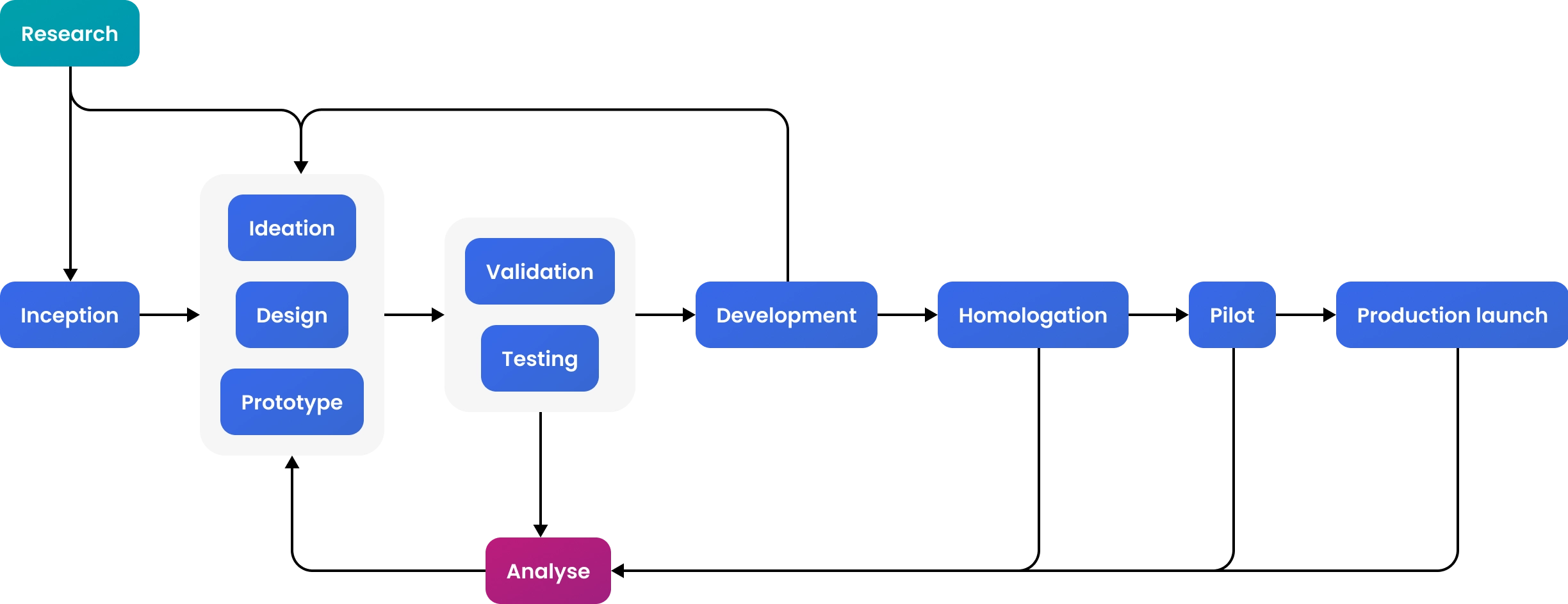
Diagram representing the project cycles and phases
In the research phase of the project, the primary focus was on understanding the target users' goals, needs, and pain points, as well as the business rules of the investment products and how competitors were addressing similar challenges. This involved methods such as interviews, surveys, and observation sessions to understand user behaviors, goals, and motivations. Each end-user segment was approached with specific methodologies.
The collected data was then analyzed to identify key patterns and opportunities. This information formed the foundation for creating user reference profiles, journey maps, SWOT matrix, and other artifacts that guided the subsequent steps of the design process.
The inception phase served as the project's kick-start. I organized and mediated these sessions, which involved multiple teams from various areas of both companies. Stakeholders, including business representatives, product owners, developers, and designers, were brought together to align on project goals, objectives, and expectations.
Given the different perspectives and priorities of each company, it was crucial to define the scope and vision during the inception phase. This helped prevent scope creep and ensured everyone understood the project's purpose and direction.
The inception phase also included ideation moments, where I applied various tools and methods to guide the sessions. This involved drafting interaction flows, user journey maps, UI sketches, and visual concepts of the interface. Additional ideation sessions were conducted throughout the project as needed, based on user and stakeholder feedback, development changes, business goals adjustments, and other factors.
The design and prototype phase was grounded in insights and information gathered from research, inception and ideation sessions, and previous feedback from users and stakeholders.
My primary responsibility was to design the complete investment flows, including visual concepts for new ideas, with the participation of the Banco do Brasil design team. We used Figma as the main tool for designing and prototyping, starting with the bank's design system components for both the app and the web platform. Often, we needed to design new UI components to address the innovative ideas from the design concepts.
Other activities during this phase included creating interaction flows, building fully interactive prototypes in Figma, and handling design hand-offs and general development documentation.
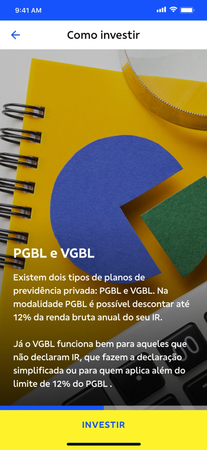
Screen samples of Banco do Brasil mobile app
Validation and testing sessions were crucial to the project's success, given the diverse needs of target users and the various teams and departments from both companies involved in development. Validation occurred in three main forms: with the end users, with business owners and stakeholders, and with product, investment, and tech teams.
For user validation, we tested the prototypes directly with the target audience. I was responsible for planning, organizing, and moderating these sessions. More details about the end-user validation process can be found in the following section.
Validating with business owners, stakeholders, and other teams required a different approach. During these sessions, the prototype was used to provide an overview of each flow, with specific topics highlighted depending on the audience. For example, when validating with the products team, we focused on how product options were presented to the end user throughout the investment flow.
The decision to advance with a particular solution was made considering the data gathered during evaluation sessions with users and stakeholders, as well as during the homologation and pilot phases. Most changes and refinements were driven by feedback from end users. However, new opportunities often emerged during the homologation and pilot phases, as these were the first real-world trials of the solution.
Post-launch monitoring and analysis focused on usage metrics, sales figures, and spontaneous user feedback and requests.
Investment consultants required a robust and flexible platform to create and personalize investment plans, offering the best options for each client. Negotiation with clients was also a key activity in the process, requiring easy to use tools to build and modify investment portfolios and provide comprehensive information about investment products upon customer request.
For clients, the primary need was to access all necessary information to understand how the investment plans work, generating interest and incentivizing the investment. The interface for simulating and configuring investment plans needed to be straightforward and user-friendly, offering essential guidance, in contrast to the more flexible and complex platform designed for managers and consultants.

Chart displaying an overview of the target-user profiles
User validation primarily consisted of moderated usability testing sessions, conducted both remotely and locally. During these sessions, users interacted with the Figma prototype, and their perceptions, opinions, questions, and difficulties were carefully noted.
I was responsible for planning and moderating these tests. The preparation phase involved defining a testing routine, highlighting key topics and issues to be assessed, and specifying hypotheses that needed investigation. Recruiting participants involved collaboration with departments like business and client relations.
Microsoft Teams was used for communication during remote sessions, and to record audio and video of user interactions with the prototype, as well as their feedback during both remote and local testing. Microsoft Forms was the chosen annotation tool, with forms created for each session detailing the testing routine, main steps, and topics to be assessed, along with fields for annotations. After each round of tests, the annotations were compiled and analyzed to validate the hypotheses.
In addition to usability tests, surveys and interviews were conducted to gather further quantitative and qualitative data about the target users.

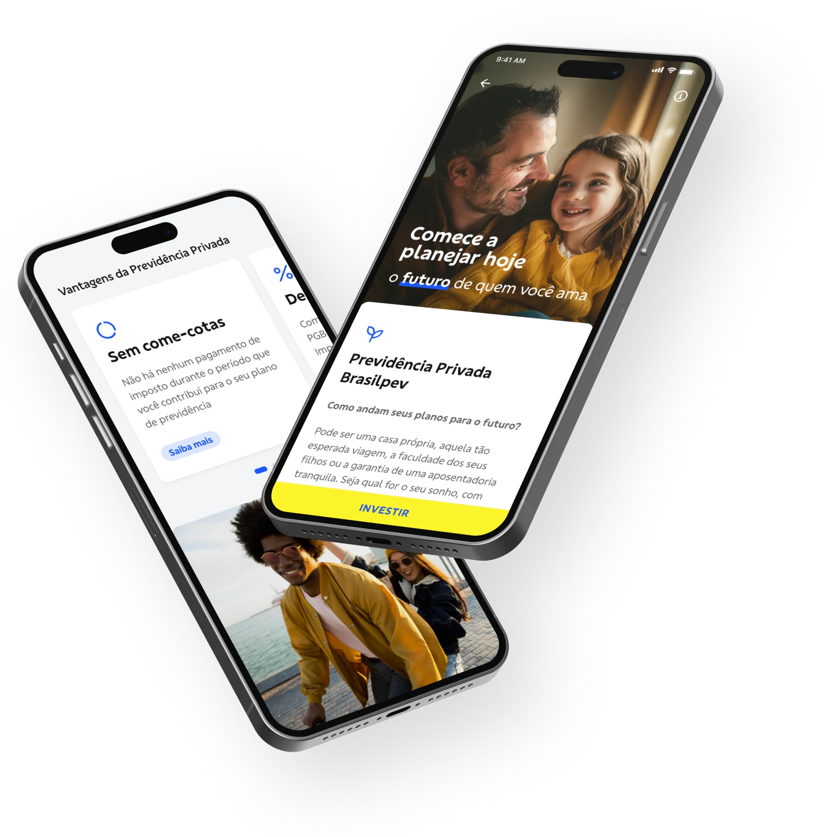
One of the key objectives of the project was to enhance the mobile app and boost conversion rates for acquiring new clients. Consequently, the project scope included redesigning the app sections related to product discovery and guidance, as well as the investment flows where clients could simulate their investment plans and make their initial investments.
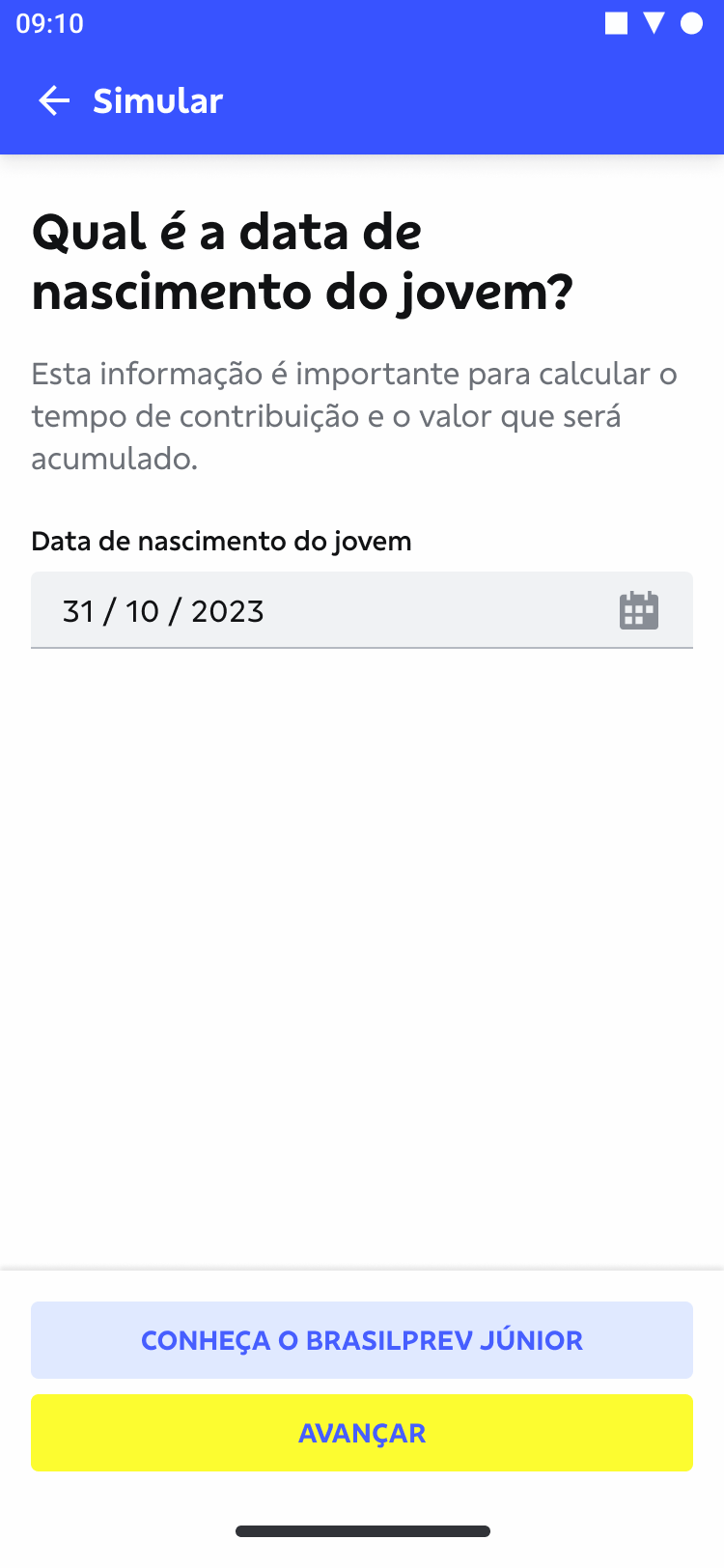
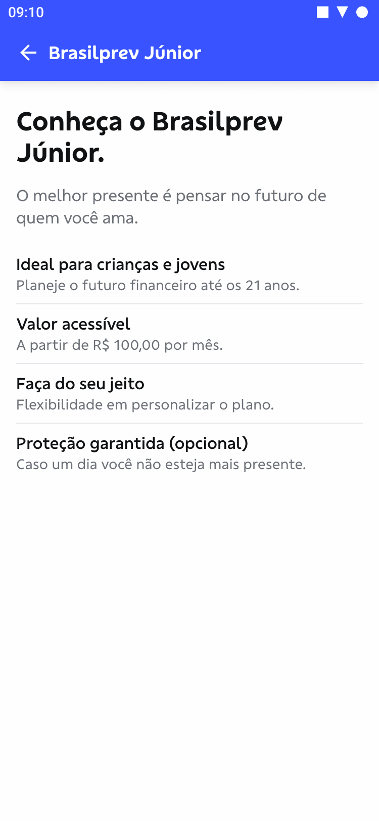
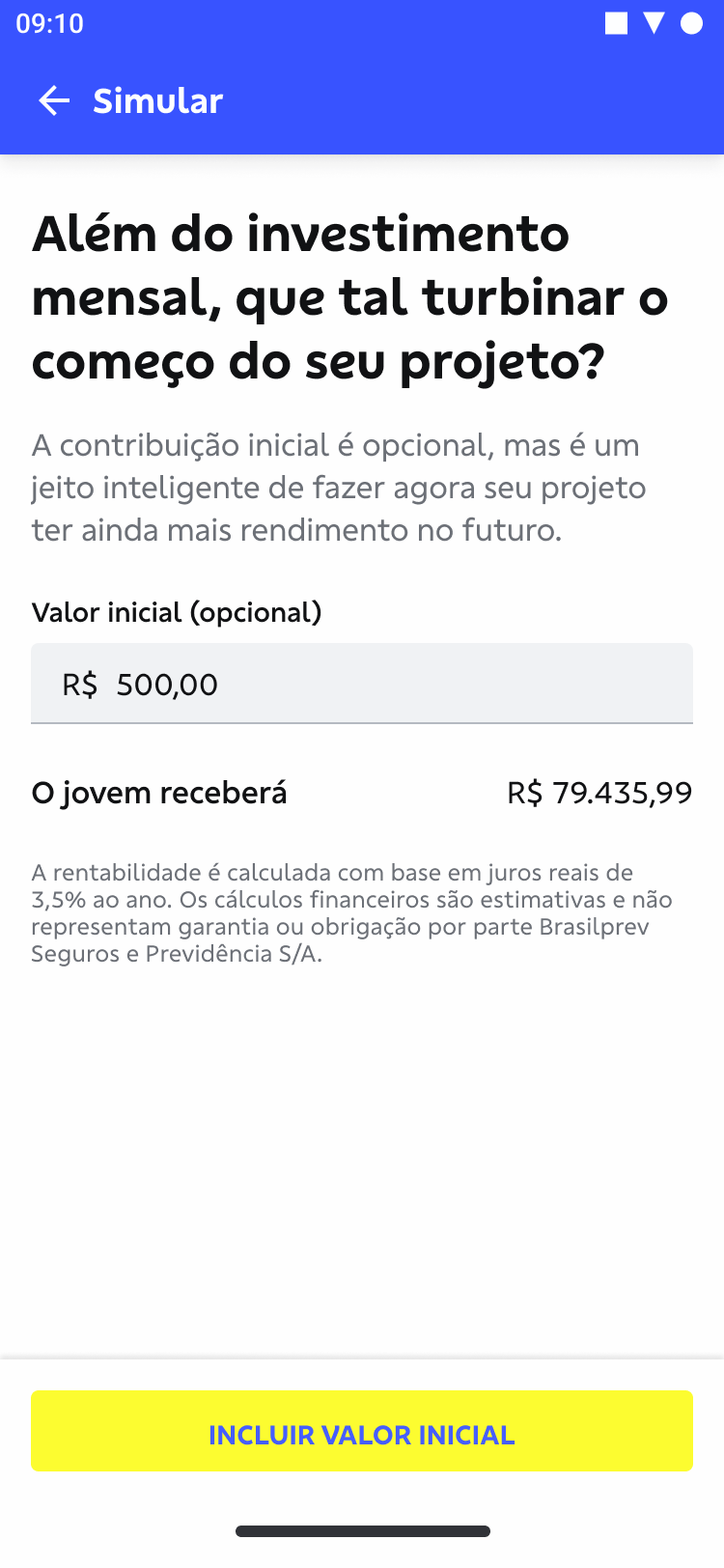
There were two distinct investment flows, each tailored to specific products: the Brasilprev Individual Plan and the Junior Plan. The Individual Plan allows clients to simulate and invest in their own retirement plans, while the Junior Plan is designed to build a financial reserve for a child or teenager, working similarly to a savings account.
The app sections included in the project scope are highlighted in blue in the following diagram.

This section will present a step-by-step overview of the investment flow design for the Brasilprev Individual product, including a detailed explanation of its functionality and the rationale behind the design decisions. The diagram below provides a simplified view of the app's interaction flow, highlighting the key moments.

Concept prototype of the initial screen, presenting the product features


This case study is currently under construction. More details about the delivered investment flow designs will be added soon.
One of the primary goals of the project was to enhance the consultant's platform, which, unlike the mobile app, served as the main investment channel for Brasilprev. The objective was to update and introduce new functionalities to streamline consultants' workflows, boost sales, and enhance customer guidance, providing more information about the products, flexibility and personalization of investment plans.
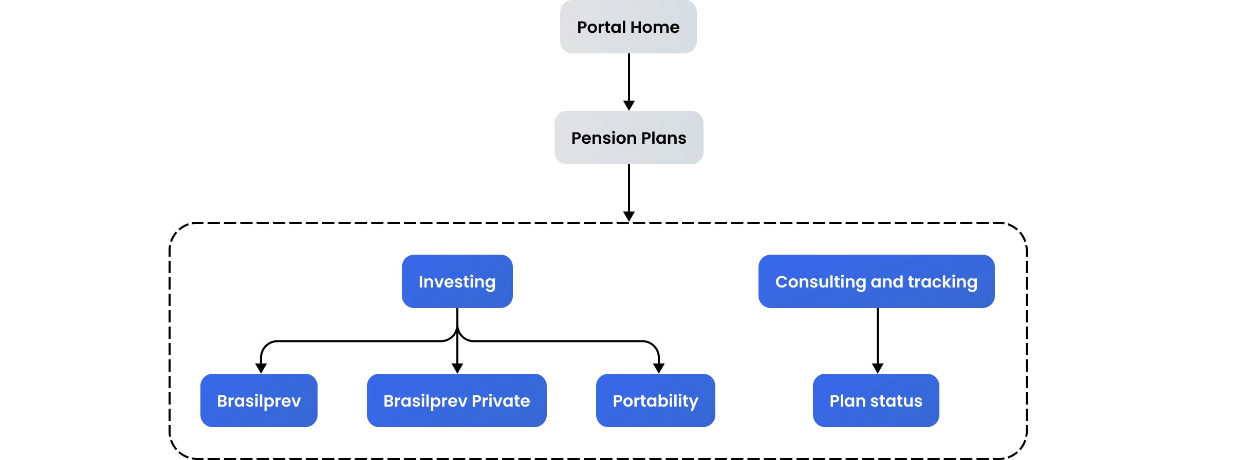
The diagram below highlights the platform sections included in the project scope in blue. This presentation will focus solely on the "Brasilprev Private" flow.
This section will present a step-by-step overview of the resulting design for the Brasilprev Private investment flow, including detailed descriptions of its functionality and the rationale behind the design decisions. The following diagram offers a simplified view of the interaction flow on the platform, highlighting the key moments.

This case study is currently under construction. More details about the delivered investment flow designs will be added soon.
During my involvement in the project, six new investment and tracking flows were designed and developed for both the manager's platform and the mobile app. These included Portability, Private Investing, Plan Tracking, and Brasilprev Junior for the platform, and Brasilprev Individual and Brasilprev Junior for the mobile app.
While it is not possible to disclose sales figures, financial data, or specific performance improvements that resulted from the new features and enhancements, these are some indicators I can share:
Improvement in NPS score following the first investment by new clients in the app
Increase in transaction volume through the Platform over the year
Reduction in lead time for portability requests on the Platform
Overall, this project presented a significant challenge due to its complexity, both in terms of project management and the variety of stakeholders and departments involved. Designing two different platforms aimed at distinct user profiles and needs, yet dealing with essentially the same products, was a unique challenge that required a deep understanding of how the proposed solutions could most effectively achieve their respective goals.
Given the challenges, difficulties, and achievements of the project, here are the most important learnings from my perspective:
Given the project's nature, frequent validation cycles with clients, stakeholders, and departments from both companies were essential throughout. While this approach occasionally seemed redundant, it was necessary to avoid and mitigate unexpected scope changes.
Complex products and transactions often lead to complex decisions for users. Delivering the right amount of useful information at the right time is essential to facilitate decision-making without overwhelming the users.
Designing for distinct end-users, even with the same end goals, posed significant difficulties. For the consultant's platform, the top priority was achieving a high degree of flexibility and customization in creating investment plans. On the other hand, the mobile app focused primarily on the discovery and guidance aspects of the user journey.