Itaú Investing Platform.
Featuring a complete update of the information architecture and UI of the investor area and investment flows presented in the Itaú mobile banking app

Mobile banking applications provide a convenient way to check account balances, make transactions, discover financial products and invest, thus usually being considered by users the preferred way to perform such tasks. However, by the time this project started, the client, Itaú Bank, had identified considerable friction in the investment flows presented in the app, leading to lower-than-expected conversion rates.
During the project, we redesigned all the investment flows. I was responsible for refining the visual design and information architecture, in order to improve the usability and accessibility, for both mobile and desktop apps.
UI Designer
Refine the visual Design, Redesign the information architecture of the investment flows


The mobile app was the most common way for Itaú clients to access and manage their accounts. However, it accounted for only a small fraction of investment transactions compared to other channels. Our goal was to redesign the flows of the main products to progressively improve conversion rates.
The internet banking website for desktop operated as a separate platform and lacked key features available in the mobile application. Our goal was to bring both platforms to parity by adding the missing features to the desktop site.
The entire mobile application was being redesigned with a new visual identity. The goal was to enhance both the visuals and the accessibility of the investment flows for the main products.
Screen samples of the Itaú mobile app, displaying its look and feel.
The most critical issues identified by stakeholders and users involved outdated and often confusing forms that were difficult to understand and featured unexpected validation rules.
Additionally, the lack of clear and user-friendly product descriptions was a significant concern, as was the poor accessibility offered by the application's previous visual identity.
To address the main issues, my first step was to initiate a discovery phase by conducting benchmark research on similar products and reviewing previous usability tests.
During the design phase, early validation using wireframes with both stakeholders and users would serve as an essential tool for continuously refining interaction flows, form structures and finally the visual design. Additionally, creating detailed accessibility documentation would assist developers in preventing inconsistencies and bugs during implementation.
During the research phase of the project, the main focus was on understanding the target users' goals, needs, and pain points, as well as the business rules of the investment products and how competitors addressed similar challenges. I was responsible for conducting benchmark and market research and collaborated with the bank's design team in interviews, surveys, and observation sessions to understand user behaviors, goals, and motivations.
The project began with an inception phase that served as a kick-start, involving multiple teams from various areas of each company. This brought together stakeholders, including business representatives, product owners, developers, and designers, to align on project goals, objectives, and expectations.
During this phase, we held ideation sessions where I collaborated with the design team to draft interaction flows, user journey maps, UI sketches, and visual concepts. Additional ideation sessions were conducted as needed throughout the project, based on user and stakeholder feedback, development changes, and evolving business goals.
The design and prototype phase was based on insights and information gathered from research, inception, and ideation sessions, as well as previous feedback from users and stakeholders.
My primary responsibility was to design the complete investment flows, including visual concepts for new ideas, in collaboration with Itaú's design team. Sketch was the main tool for designing and prototyping, utilizing the bank's design system for UI components. However, we often needed to create new UI components to address the ideas generated during the design process.
Other activities during this phase included building fully interactive prototypes in Figma, and preparing accessibility and general development documentation for design hand-off.
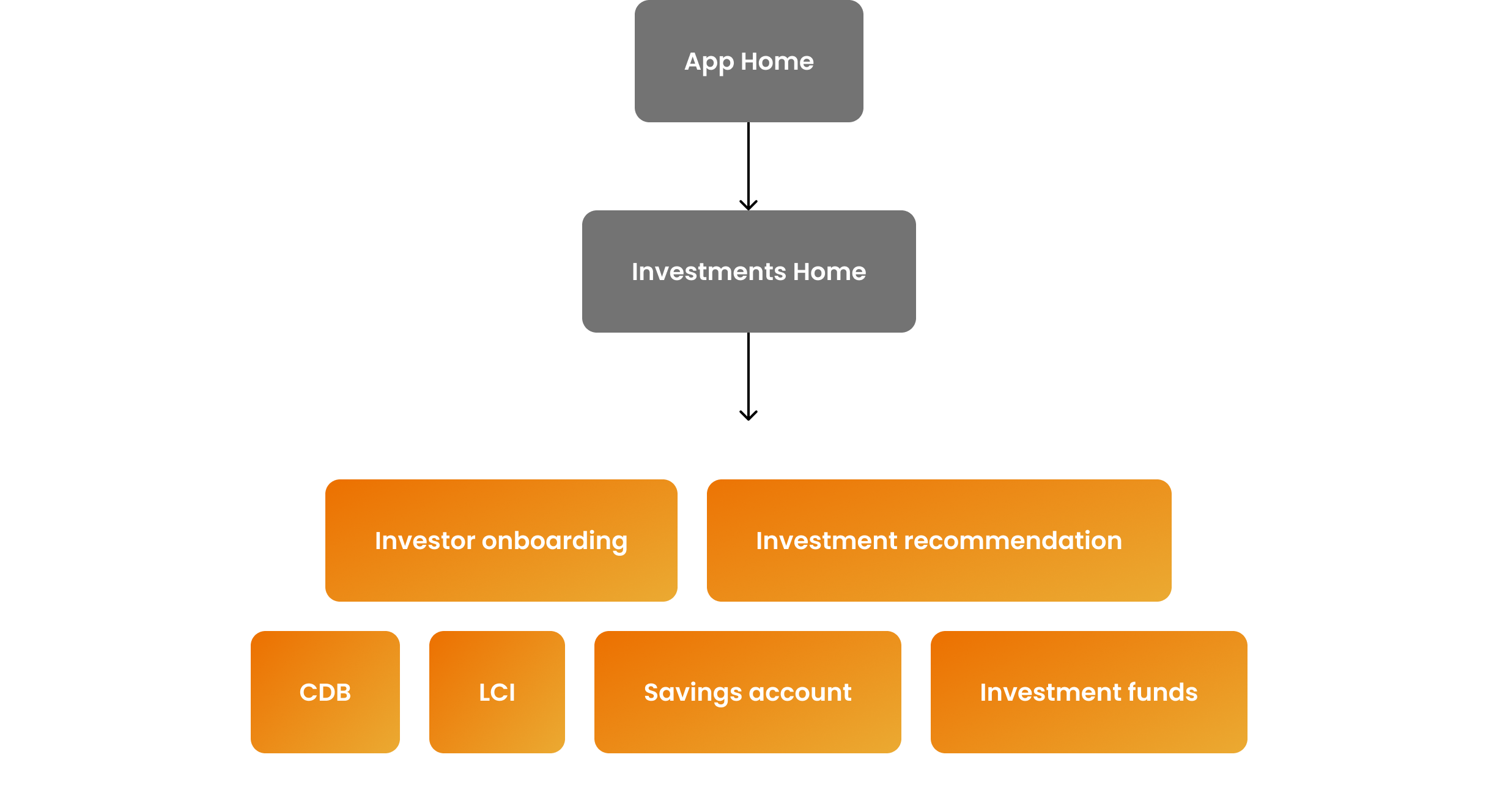
The key objectives of the project were to enhance the investment flows of four different products to increase conversion rates. Each product had specific business rules, necessitating unique forms and presentations of investment options.
Additionally, we aimed to guide users throughout their investment journey. To achieve this, we designed two solutions: an onboarding section for new users and an investment recommendation feature, both integrated as initial steps in the investment flows.
The app sections and flows included in the project scope are highlighted in orange in the following diagram.
The proposed design process for the project was non-linear, with activities occurring simultaneously and in cycles. This approach was necessary to enable multiple validation phases throughout the project, allowing for early adjustments and minimizing unforeseen scope changes.
An overview of the design activities is illustrated in the chart below:

Visual representation of the project phases, displayed in weeks.
During the discovery phase, we interviewed a pool of clients to gather their impressions of the investment section of the application and their experience navigating the purchase flows.
We discovered that the most critical issues were unappealing product descriptions that lacked necessary details and failed to motivate users to purchase. Additionally, the information architecture and form structure were difficult to read and understand.
To address these issues, we enhanced product pages and forms by improving the copy, simplifying content, and presenting clearer and more relevant information about each product. Usability was improved with larger fonts and increased contrast of UI elements. We also enhanced system performance and responsiveness, and used motion design techniques, micro-interactions, and screen transitions to create a faster and more engaging user experience.
Example of key moments of the user journey.

Samples of the new onboarding concept for the investments section, explaining investment recommendations and user profiles.


Samples of the design concept of the recommendation section of the web app, explaining investment fundamentals

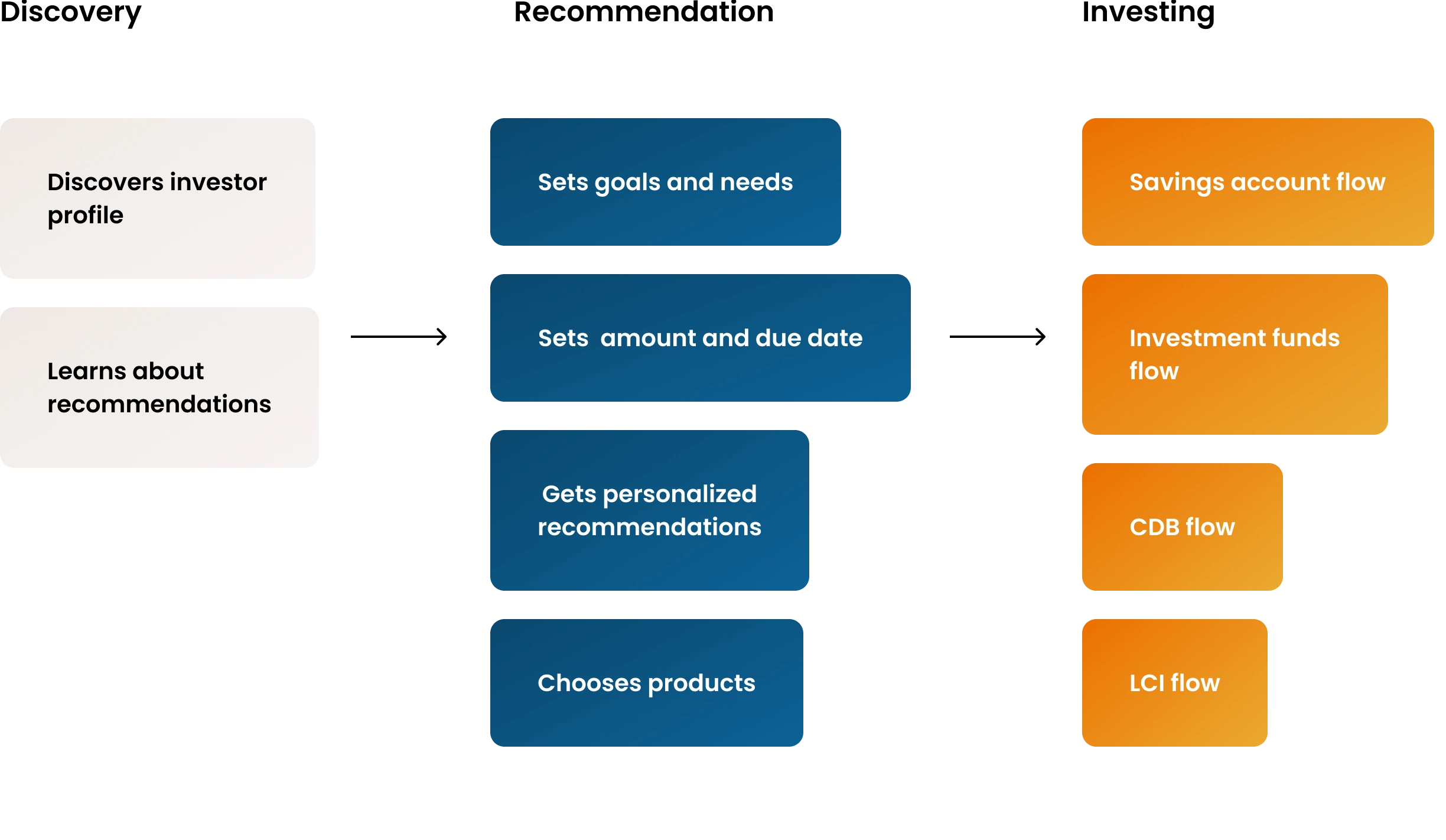
Examples of the recommendation flow in the mobile app: a form for entering the investment amount and period, asset recommendations based on the investor's profile, and suggested investment funds.
The redesign introduced new input components with larger, easier-to-read text, improved color contrast, and an updated content hierarchy, significantly enhancing overall usability.
Reorganizing the content order and structure of each form made them more accessible to screen readers. All the new accessibility improvements were thoroughly tested by the QA team and validated using popular screen readers like Google's Talkback and Apple's VoiceOver.
Specifies the reading order and grouping of UI elements

1.Application
2.Back, button
3.Antônio, You are just a few steps away from investing
4.1Available balance
4.2Expand, button (nested element)
5.CDB Pre, application, form
6.1Amount to apply, 500 Reais
6.2Edit, button (nested element)
7.1Due date, 90 days
7.2Expand, button (nested element)
8.Profitability, 10.12 percent per year, 4.2 percent in the period
9.Tip, Your investment balance ...
10.Product details, Minimum application amount, 500 Reais, risk ...
11.Apply, button, disabled
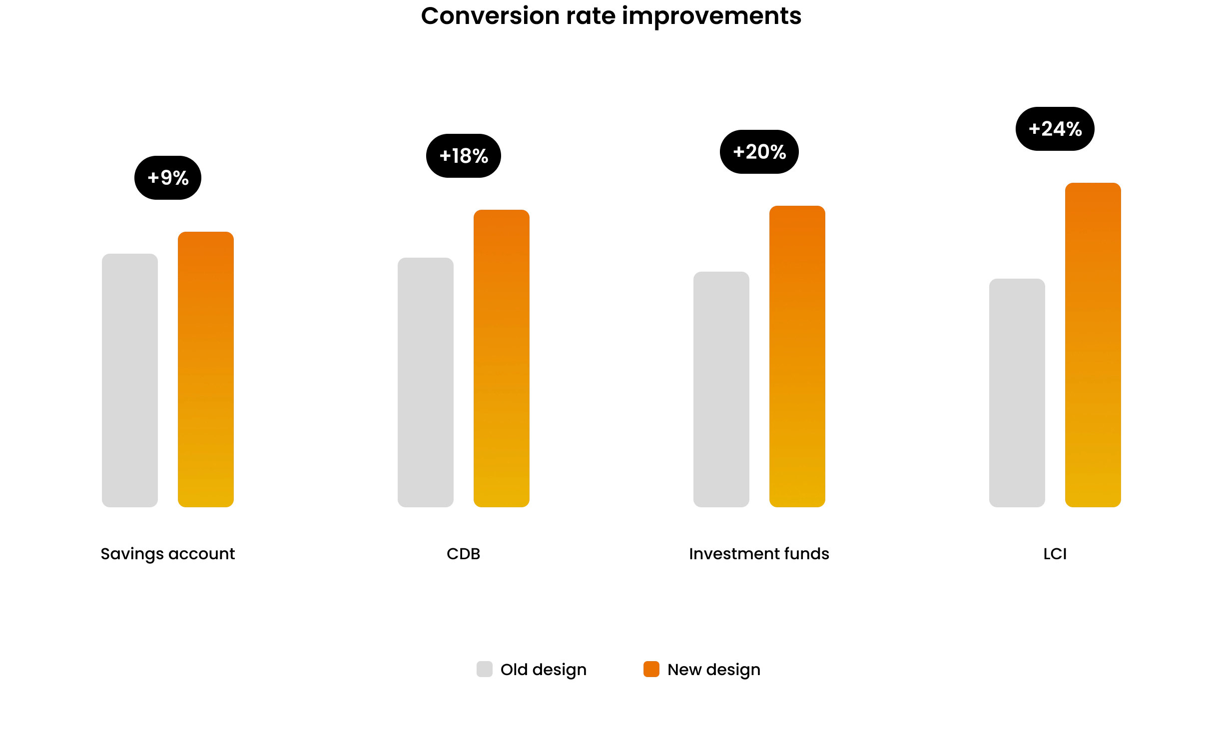
One of the primary goals of the project was to improve the conversion rates of the investment flows, and the redesign successfully achieved this. Within 30 days of deploying the new design, both conversion rates and transaction volumes improved. The most significant improvement was in the LCI product, which saw a 24% increase in its conversion rate.
Additionally, overall user rating scores, measured after successful transactions, improved by up to 25%, reaching 4.5 on a scale from 0 to 5. Unfortunately, further KPIs cannot be disclosed.
Reflecting on the challenges, difficulties, and achievements of the project, these are the key insights and lessons I have gained:
We restructured the investment flows by adjusting the hierarchy, grouping, and clarity of UI elements. These usability improvements were evident from the first user validation sessions, even though the investment products and business rules remained unchanged.
A key principle for this project was to use only the standard components from the existing design systems for both the mobile and web apps. However, this proved to be overly optimistic. In practice, we had to create multiple new components, particularly for the new onboarding sections.
Detailed guides simulating step-by-step navigation using native screen readers served as essential resources for developing accessible UI elements. Additionally, these documents provided a useful reference for the quality assurance team when validating accessibility implementations.